Why is it that doctors have all the worst art in their offices? You'd think they'd be able to afford something really nice, but everything looks like it belongs at a thrift store. I get that you can't put anything crazy like a Hieronymus Bosch in the waiting room of your dentist's office (though Ive been to a dentist where that would have fit right in with his bedside manner) but you can certainly do better. All this brings me to a painting hanging in the office of my doctor. It depicts a man standing behind a basket that is filled with severed heads. The basket is cleverly labeled "new heads" in case there was any question of what it contained, and is in theory supposed to represent how great it would be if you had an issue with your own mind to just swap it with a spare. I personally read it as the young man that created the painting is in no subtle way trying to tell you about his love for dismembering human bodies and what would be found beneath the floor boards of his kitchen should you be curious. His confessional looks like it was created by a fifth grader, which adds the unease I feel every time I look at it. The only time I think a boring painting by Monet would be a bit more appropriate is if it is replacing one given to you by the criminally insane.
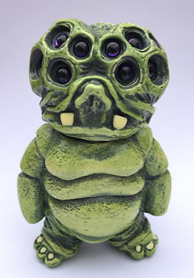
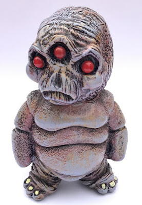
Having multiple heads lying around isn't always a bad thing, even if they do come knocking on your door with a search warrant. Case in point, this new creation from We Become Monsters. It's called The Heck, and is a scaled down version of one of his other figures, The Hell. There are three different colors of this four inch figure to collect, and each comes with an alternate head for mixing and matching how you see fit. Available exclusively from http://webecomemonsters.storenvy.com, these suckers are hand made and extremely limited.


